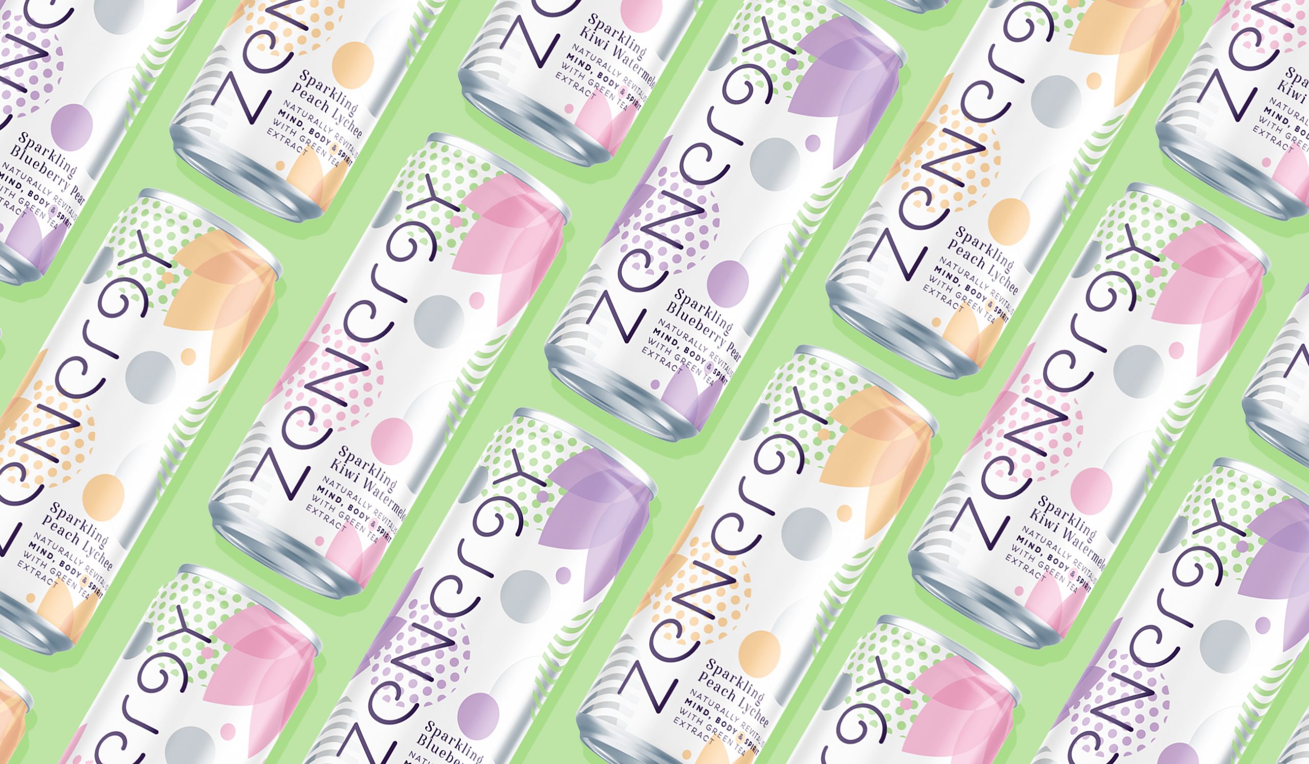
Naming
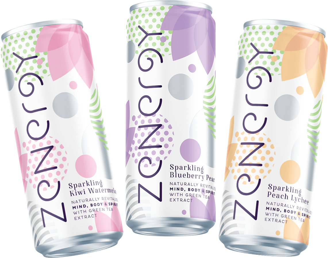
Packaging
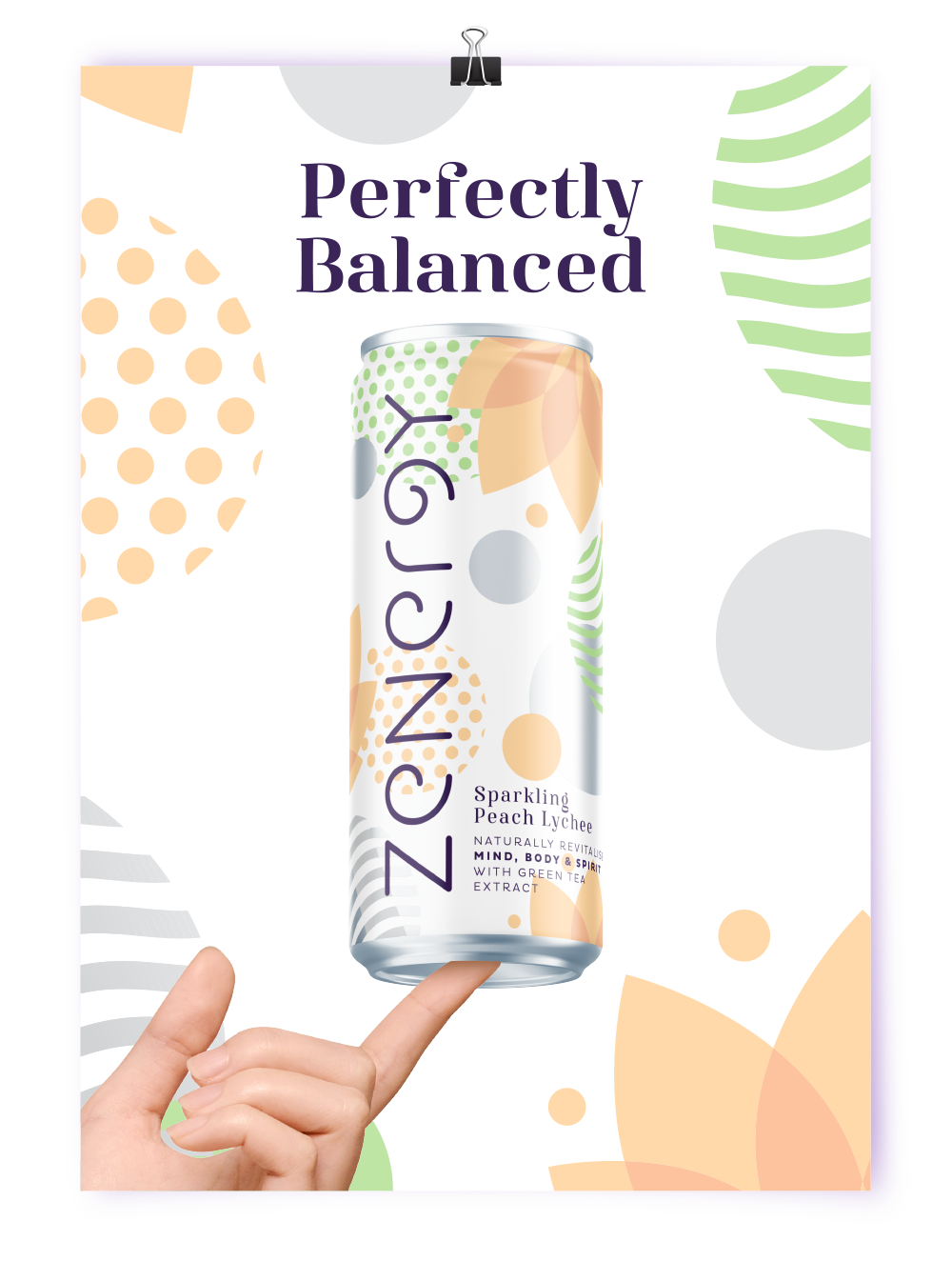
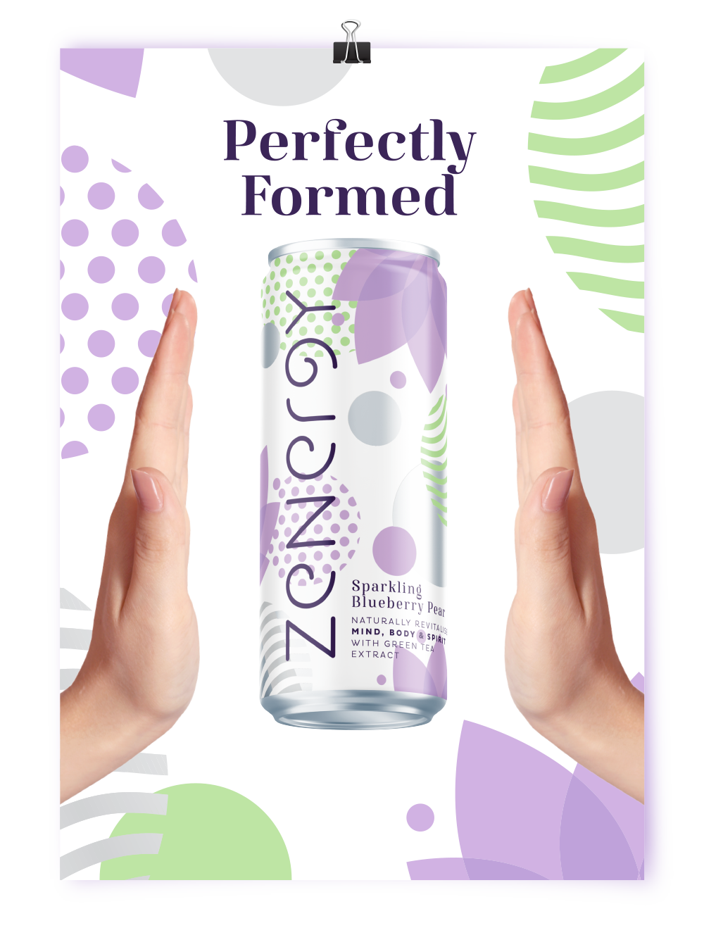
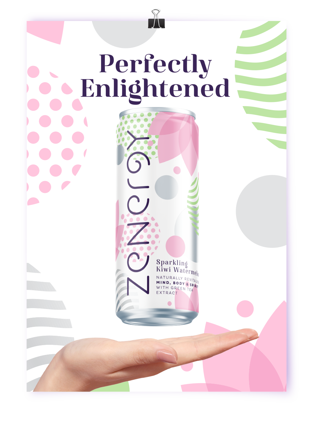
Adcepts
Challenge
We were challenged to create the healthiest and freshest brand proposition with wistful female appeal. Targeting 25-34 year old women who enjoy on-the-go beverages (like diet coke) but are looking for something a little bit healthier with natural benefits (and maybe even a dash of energy).
Result
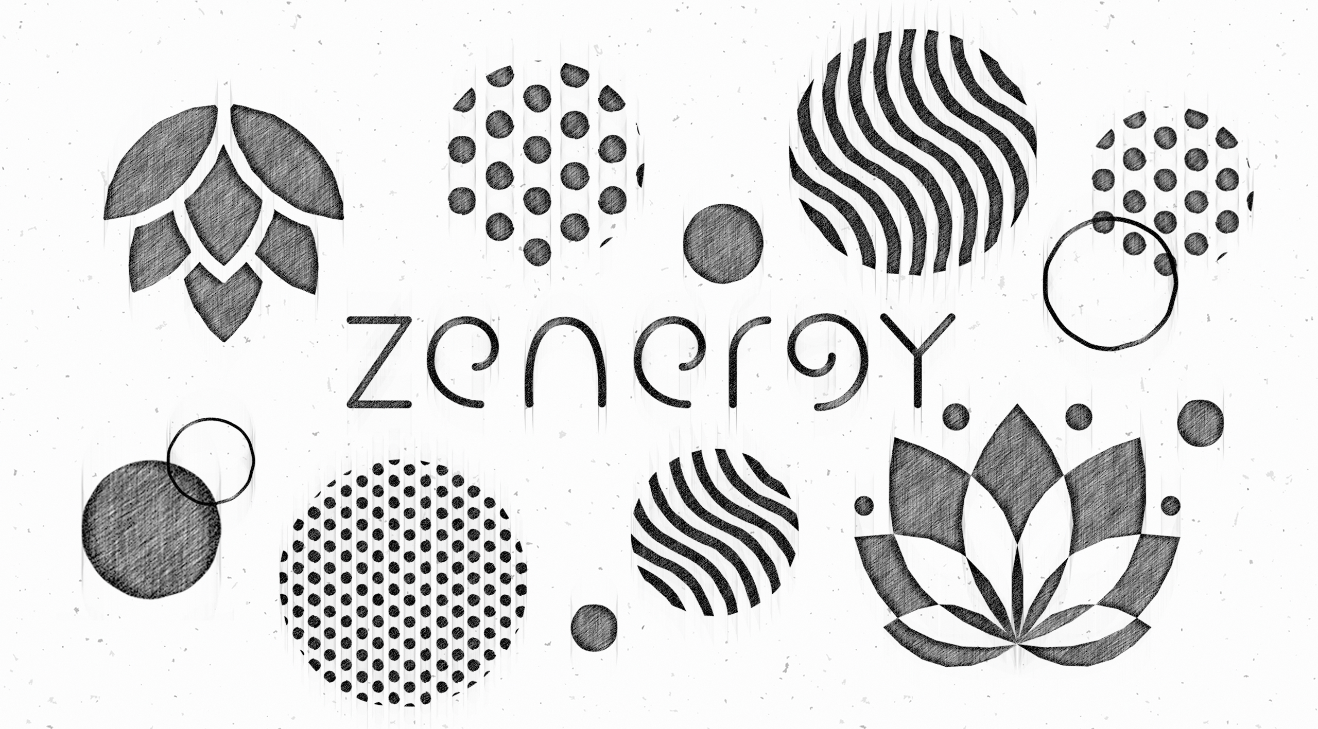
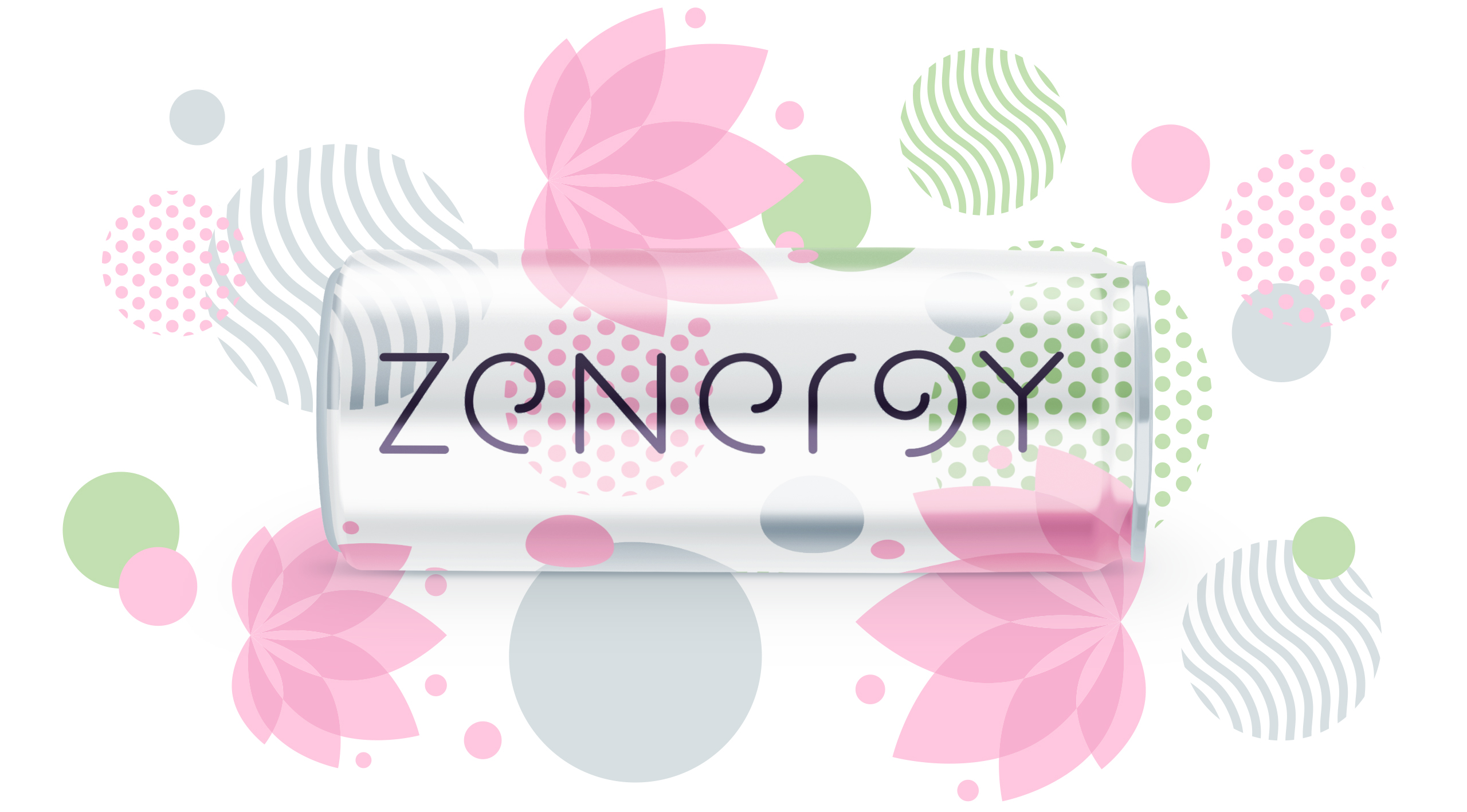
A brand to rejuvenate your mind, body and spirit. Zenergy is designed to bring harmony between refreshment and energy, giving a grown-up alternative to the current category. A flowing brand ident and supporting pattern inspired by lotus flowers and the enso circle creates a perfectly balanced brand.
The Process
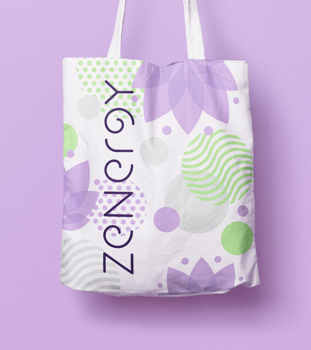
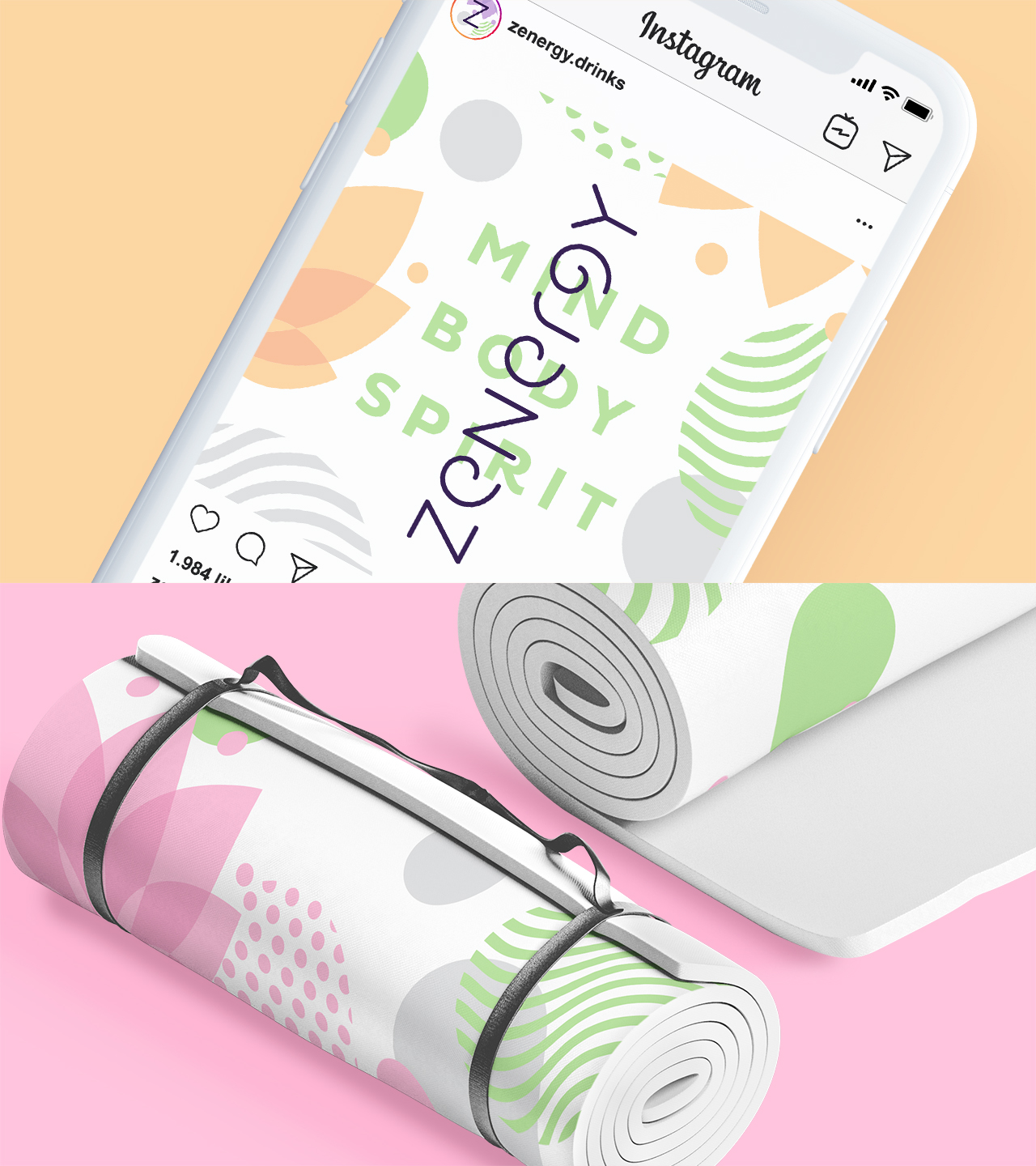
We created a number of supporting brand assets for future roll-out, including merchandise and social media content. The pattern proved to be a great asset as it creates consistency across media and a unique brand look.
Stand Out
Zenergy not only aims for stand-out on shelf but also on consumers’ social feeds, and we wanted to make sure it was a brand our consumers would want to be seen with.